Know your objectives and your audience
First things first, it’s important to set some clear KPI goals that align with the purpose of your landing page. These KPIs will act as your guide through the creation process and keep your content focused. Some examples include:
- Conversion rate – Setting a specific target for the percentage of visitors who complete the call to action on your page
- Lead generation – Specifying the number of leads you want to generate through form fills whilst the landing page is live
- ROI – Calculating the ideal return on investment for the landing page – considering both monetary and non-monetary value
Although it may not be part of your objectives, you should have a clear idea of your target audience and what makes them tick. For the visitor to resonate with your content, you need to understand their pain points and use references and language they relate to. If you don’t have enough information on your target market, it may be worth holding some research sessions and buyer persona workshops with your team to get a good insight on what you’re working with.
Check out our buyer’s journey blog for more insight on how to create buyer personas!
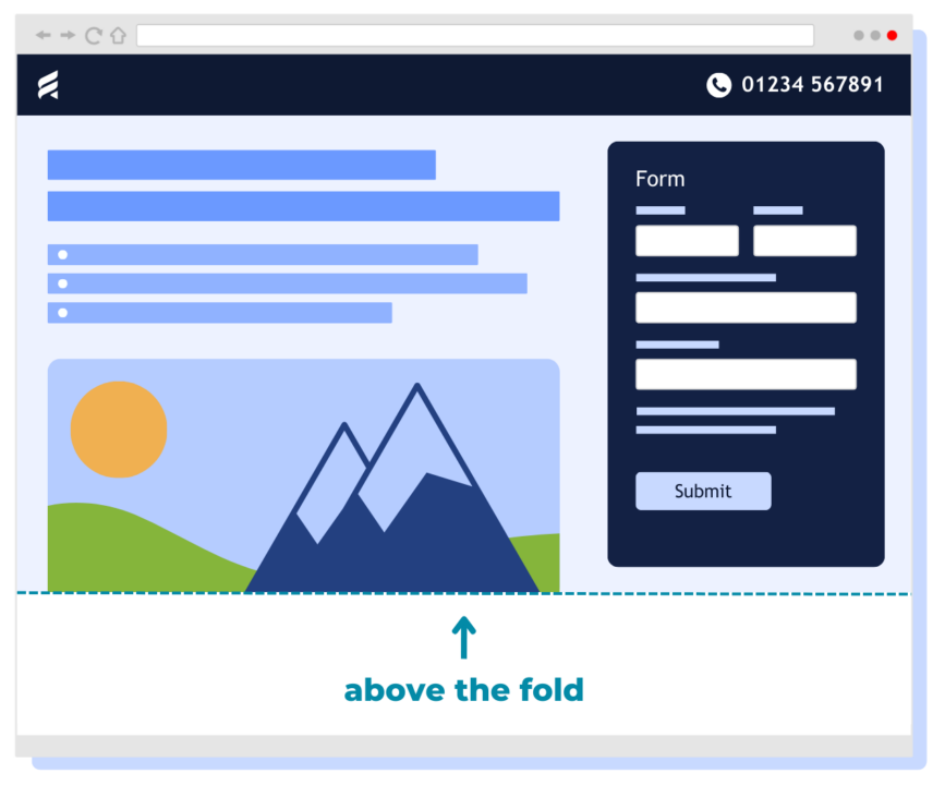
Content above the fold
Now that you have a solid set of objectives and you’re clued up on your target market, it’s time to get into the content. ‘Content above the fold’ is the very first section of the landing page your visitor will see when they click through, and this is what makes it so important! With the average landing page bounce rate being upwards of 70%, it’s highly likely that this is the only section many of your visitors will see, so you need to grab their attention straight away.
Although it’s a small amount of space, there are a lot of things you can do to make it count…
Headlines
All great landing pages need to start with a compelling headline that includes a value proposition. Your visitors are a lot more likely to stay on your landing page for longer and complete a form if you’re offering them value or some form of benefit in return. Whilst some landing pages offer more immediate value (such as a discount offer or a piece of gated content), you can also win your readers over by explaining the user benefits of your product or service.
Copy
Any copy included above the fold needs to be concise and minimal. You want to reinforce your value proposition with short sentences or bullet points, providing any key information that is vital for the reader to know. Remember, they may not make it to the end of your landing page!
Images
If you have a strong headline which explains everything your reader needs to know, you may want to replace the copy with an image. This should be thoughtfully designed to support and enhance your message.
CTAs
Whether you choose to use copy or an image along with your headline, you need to include a clear CTA. What action do you want your reader to take when they visit your landing page? For instance, do you want them to click through to another page via a button, or fill in a form?
If your CTA is a form completion, you should only include fields that are essential. This helps to keep the length of the form concise and increases the chance of someone filling it in! Don’t forget that it’s also a legal requirement to include a link to your privacy policy whenever you’re gathering data! See this ICO webpage for more information on how to be GDPR compliant.
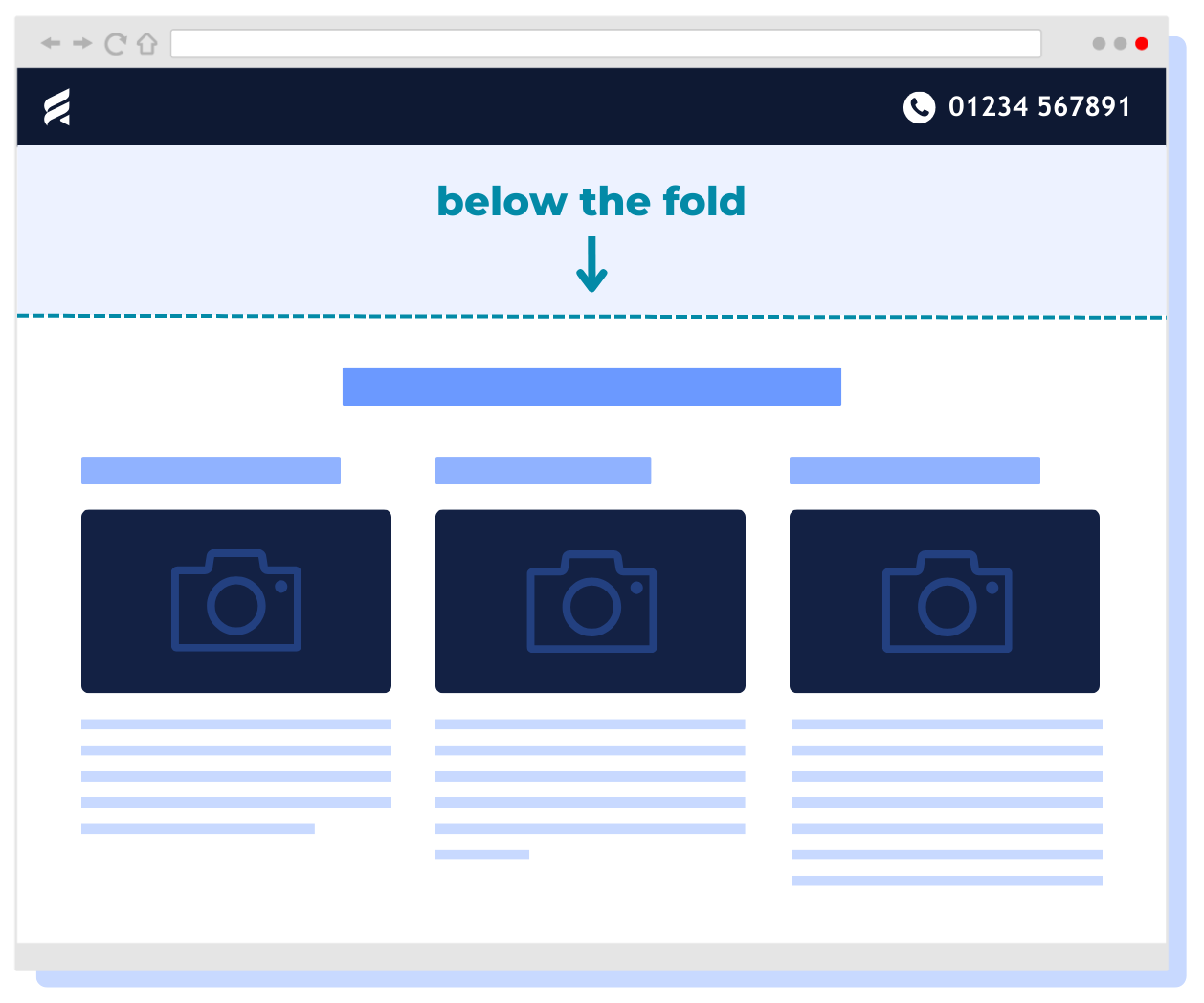
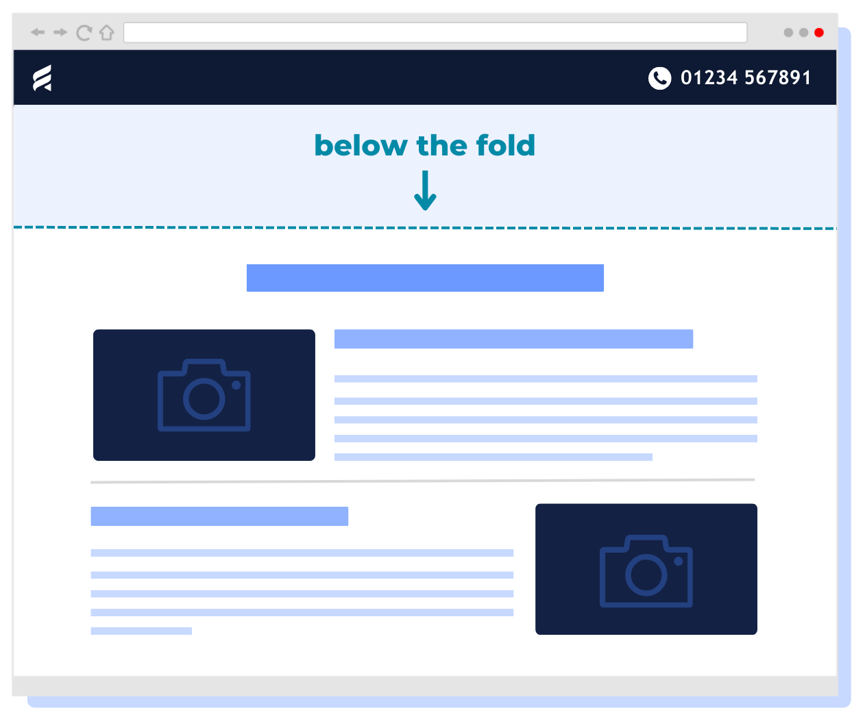
Content below the fold
Now that we’ve looked at content above the fold, it’s time to think about the rest of your landing page. Even though you’ve crossed the first hurdle of your visitor scrolling further down the page, your content still needs to be to-the-point. This space needs to be used to sell your value proposition if the reader isn’t yet convinced. We recommend using one of two layouts for this area:
Columns
Using columns will reduce the amount of scrolling required by your reader, and will present everything in one screen. In our own landing pages, we like to use a maximum of 3 columns to present our value proposition. Typically, each column includes a heading, a correlating image, and a short amount of text – two sentences max!
TOP TIP: Once you have added this supporting content, it’s worth including your call to action again. Use buttons to link to the relevant webpage, or use it to create an anchor point back to the form.
Rows
For landing pages that require more descriptive text, a row layout will be more suitable for your content. You should use the maximum page width setting available to reduce the amount of scrolling needed. Although this layout is suitable for more text, we suggest not going overboard with large paragraphs. This is where catchy headings come in – if the visitor reads nothing else but your headings, they should still be able to grasp what it is you’re trying to convey or explain!
At this stage, you might also want to consider adding in some customer testimonials, customer reviews or awards that clearly link to the context of your landing page. If the reader has never heard of your business or product before, it can be a great way to build trust. And don’t forget to link this back to a customer case study if you have one available on your website!
Optimisation for the best user experience AND end results
We have touched briefly on the idea of user experience, like keeping your page length and copy short. But there are a few other final checks that need to be made before you hit that publish button!
Navigation & links
The main purpose of a landing page is to retain your readers’ attention and generate conversions. In an ideal world, you will be using a template that does not include menu navigation. This prevents your visitor from getting distracted and going through other areas of your website that aren’t relevant at this specific point in time.
However, when conducting analysis on our own landing pages, we did find from heatmaps that many visitors were trying to click through to our home page via the company logo in the top left-hand corner. We want readers to be focussed on the landing page in hand, but we also don’t want to leave them feeling frustrated that they can’t navigate in the way they want to. Good user experience is vital, and even though you want visitors to stay glued to your page, you shouldn’t ignore their behaviour. Even if it’s different to what you expected or wanted. Flexibility and adaptability on your side are good qualities to practice to ensure their experience on your page is a positive one.
When it comes down to links within the body of your landing page, the only ones that should be available are those that are part of a call to action. Avoid using hyperlinks. If there is extra information that you want to get across that isn’t available on your page, try going back a few steps and incorporating it into your copy.
Desktop & mobile optimisation
There’s nothing more frustrating for a user than landing on a page that isn’t designed for mobile. It can feel clunky and often comes across as careless. When you’re creating your pages, make sure you preview them in a mobile view and make relevant changes.
Success pages
If you have included a form on your landing page, you will also need to create a corresponding success page that appears once the form has been submitted by the visitor. This page should be simple and short, simply thanking the visitor for their details and letting them know what will happen next. Will you be in touch with them? Will they receive an email?
This is also the point in which you can consider adding in some other links. Why not kickstart the next stage of their buying journey by offering them some relevant blogs and case studies?
Analyse, edit & repeat
Like with anything in the world of marketing, it’s good practice to analyse your landing page results. Key metrics to watch out for are scroll length, bounce rate, conversion rates and time spent on page. Taking note of these regularly will help you track performance and identify where improvements need to be made. You could also consider A/B testing two versions of your landing page over a set period to assess which format is yielding the best results.
Check out our Metrics That Matter: Landing Pages blog for more helpful information on analytics!
Remember that not every landing page will perform in the same way as the last. But, with these optimisation tips and tricks, along with your own analysis and findings, you will be in a great position to make informed edits and additions to meet your objectives.